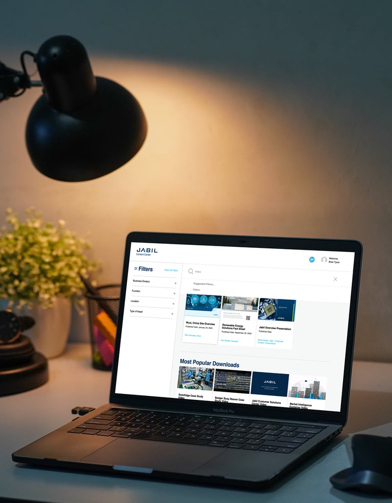
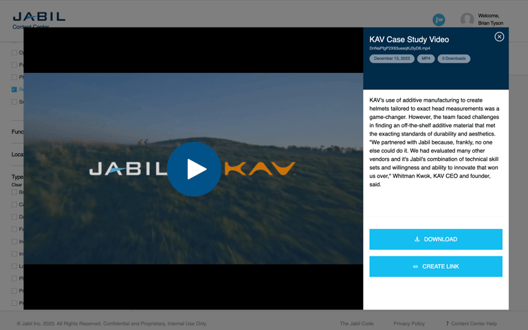
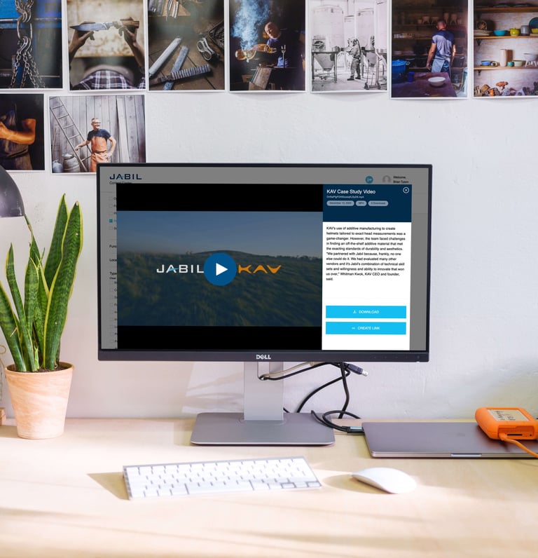
Jabil needed to consolidate multiple content systems and improve cross-functional adoption.
Challenge
My Role
Led end-to-end UX/UI design, user research, and stakeholder collaboration.
83% adoption at launch, became the central hub for 50,000+ employees globally.
Outcome
My Design Process: The 5 Ds of Iterative UX/Product Design
The 5 Ds stand as the cornerstone of effective UX design and product development, guiding teams through the iterative process. These key stages are crucial in crafting a user-centric product and serve as my go-to framework when spearheading UX design projects.
Discover: Research and uncover the needs of users and stakeholders.
Define: Clearly state the needs and problems identified in the research phase.
Design: Challenge assumptions, generate ideas, and create innovative solutions.
Develop: Bring ideas to life through building and testing solutions, iterating as needed.
Deploy: Launch solutions, measure performance, and analyze results for further improvement.
As will be demonstrated in this case study, by adhering to the 5 Ds framework, we effectively designed, developed, and launched Jabil's Content Center platform in a systematic and efficient manner.
Discover
Through stakeholder and user interviews, surveys, and usability audits, we discovered that users and producers of enterprise materials at Jabil were struggling with scattered, duplicated content, ineffective search functions, and a lack of version control. This led to confusion, frustration, and inefficiencies in the workflow.
Research Objectives
Understand the current processes and workflows for enterprise materials production and distribution. Next understand the pain points for enterprise material producers and consumers (the key user audience).
Research Methods
Conducted stakeholder and user interviews, user surveys, and usability audits of current enterprise distribution channels. Stakeholders included marketing managers and leadership. Users included corporate employee sets from Jabil's 4 main regions: Asia Pacific, Europe, Latin America, and North America.
Key Findings
Users and producers of enterprise materials were confused. Enterprise materials were scattered and duplicated across a myriad of different team portal sites.
Search yielded thousands of results, 90% of the time users were not successful in finding the materials for which they searched.
Version control was non-existent. Material producers were inundated with one-off requests for the latest version of a document or media piece.
Define
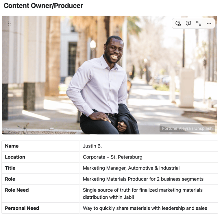
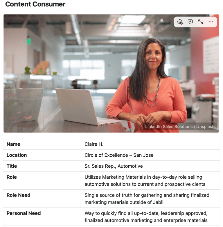
With a clear understanding of the challenges faced by employees, we developed user personas and journey maps to outline the needs and expectations of content consumers and producers. The problem statement highlighted the broken distribution system and the negative impact it had on employee productivity and business opportunities.
User Personas
Developed comprehensive personas that accurately depict the primary target users of the Content Center. Instead of utilizing complex divisions based on business unit or company function oriented user profiles we focused on the two major audiences: Content Producers and Content Consumers.
User Journey
Created journey map for the multiple paths users might use to find various materials: browse, filter, and search. Also created journey maps to define the easiest flow for content owners/producers to add, update, or archive materials.


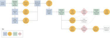
↑ User Journey Map / Screen Flow for Content Center
Design
After conducting brainstorming sessions, we created wireframes and prototypes to visualize the app structure, interface elements, and key interactions. Two rounds of user testing helped us refine the design and enhance features such as asset management and search functionalities.
Ideation
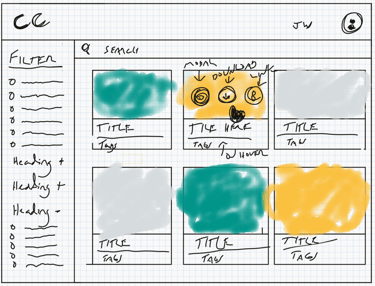
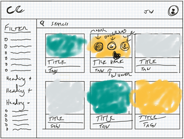
Conducted brainstorming sessions to define the necessary parameters which would enable proper content management and enhance the user experience of finding content and materials quickly ... content types, categories, and naming conventions.
Wireframes
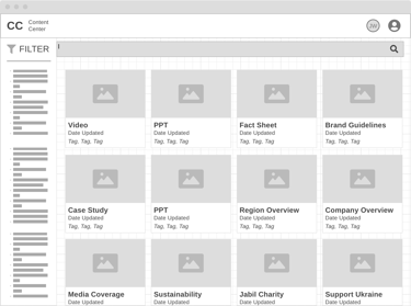
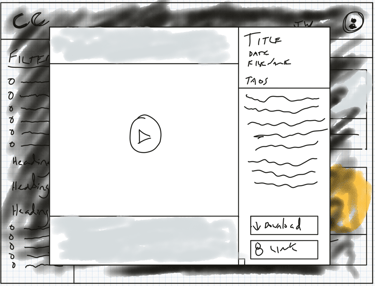
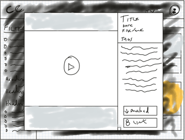
Developed low-fidelity wireframes to outline the app structure, decide on necessary interface elements, and finalize feature placement.
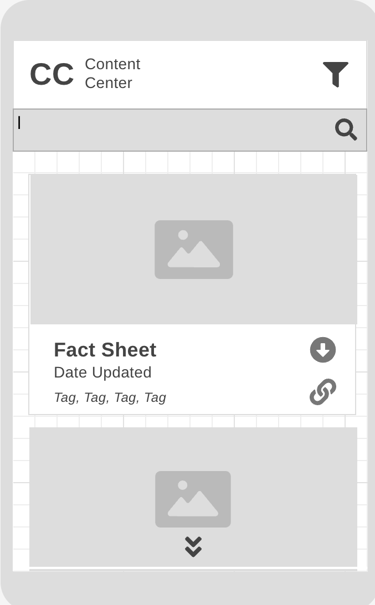
Note on Mobile: Because Jabil's mobile device engagement was typically < 4% of users on enterprise tools, we focused on desktop devices. However mobile wireframes were included to show developers how layouts should collapse/modify for mobile.
User Testing
Conducted two rounds of usability tests, both remotely and in-person, with stakeholders and users via the prototype to gather feedback and refine the designs. Key insights included:
Users liked the clean/modern design.
Users appreciated the ability to easily search and/or filter for assets.
Asset preview, download, share, and asset management features were appreciated by both personas.
Some users were confused by the filter / search flows. Decided to add helpful UI text and filtered by labels as a solution.


Prototype
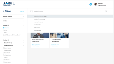
Created a high-fidelity prototype showing the all visual design decisions and key interface feature interactions, including filtering, sorting, searching, asset interactions, and material update flows for content owners/producers.


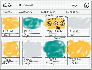
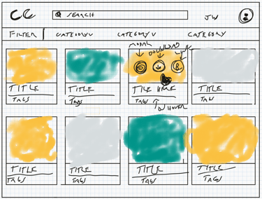
↑ Digital Thumbnail Sketches – recording layout ideas during brainstorming sessions
↑ Lo-Fi Wireframe: Desktop – outlining the structure, necessary UI elements, and finalized feature placement
↑ Lo-Fi Wireframe: Mobile
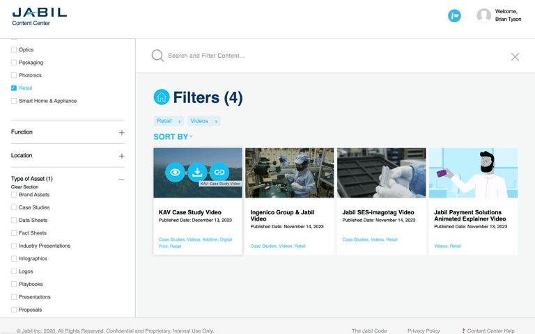
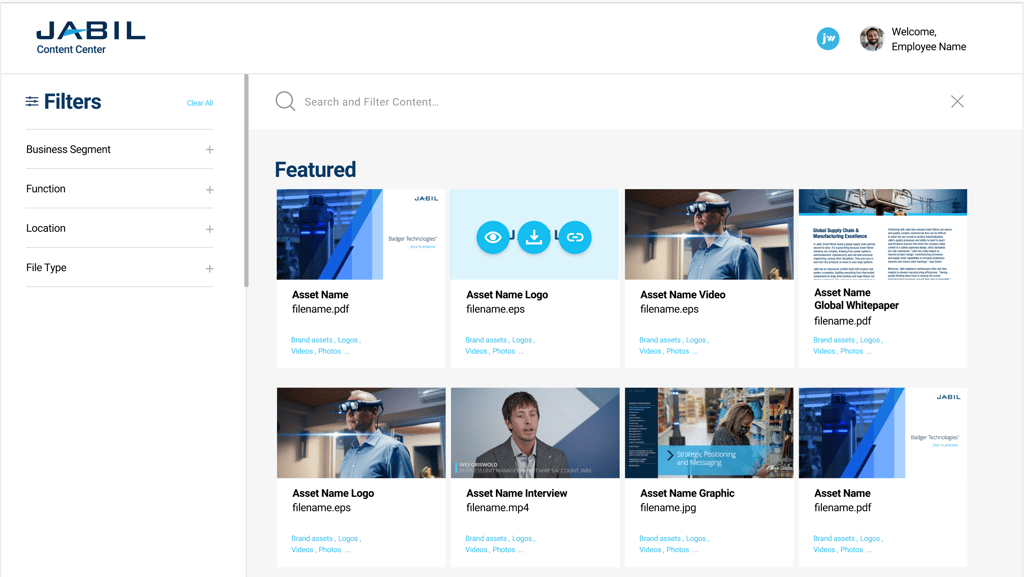
↑ High-Fidelity Prototype – showing view/download/link buttons on card hover
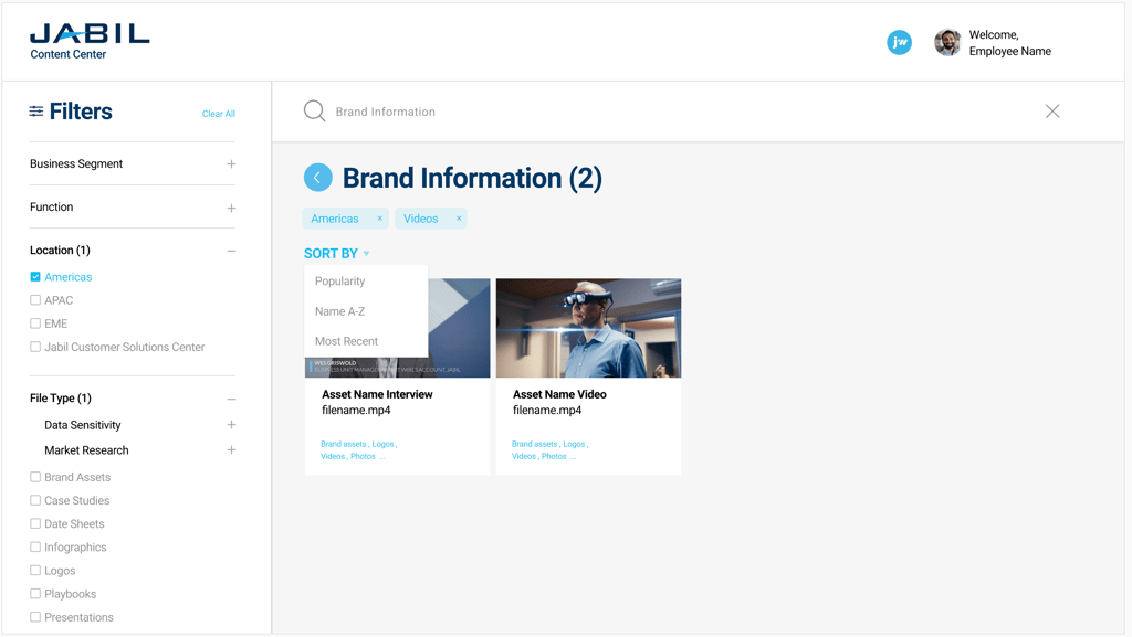
↑ High Fidelity Prototype: showing filtered content view, category labels removed via click, and sorting functionality
↑ High Fidelity Prototype: showing search suggestion functionality
Develop
Close collaboration with developers ensured that the designs were implemented accurately, despite technical constraints. Throughout the development phase, we iterated on the design based on user feedback and challenges faced by the development team. One major challenge was balancing the need for efficient content management with a seamless user experience. Automation of asset expiration, notification, and archival processes, as well as implementation under Okta SSO for security, helped address this challenge.
Collaboration with Developers
Worked closely with the development team to ensure the designs were implemented accurately and efficiently. Project update calls were held with developers weekly to review progress, answer questions, and discuss challenges.
Challenges
Faced challenges in balancing the need for providing easy enterprise material management while providing a seamless user experience for content owners/producers. Overcame this challenge by implementing an automated asset expiration workflow including: automated emails, automated asset archival, and a front-end asset management system. All of this under Okta SSO for security and user identification.
Made several iterations based on user feedback and technical constraints. For example:
Replaced 'filename' text with 'date last updated' text on the asset card component, since this information is more valuable to users.
Added additional conditional UI text to the filters component, to give user contextual information on which filters were currently applied.
Design Iterations
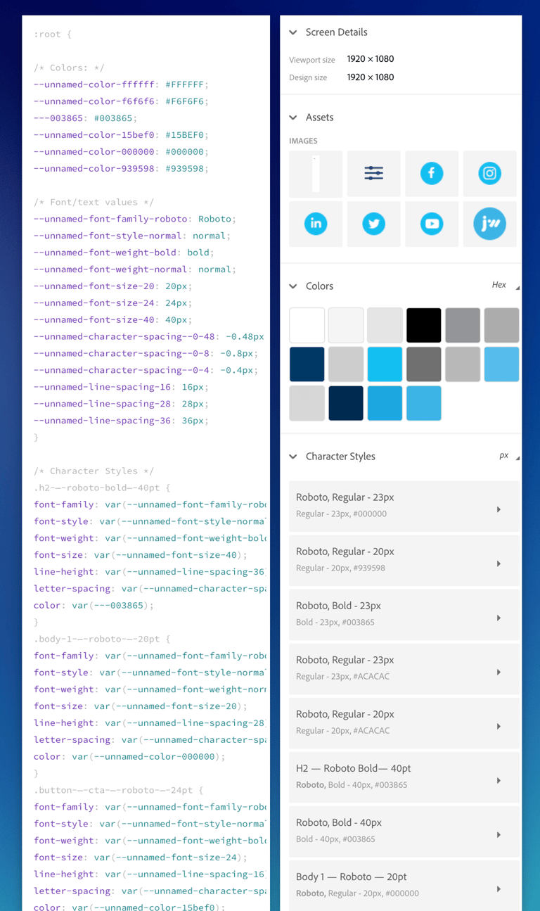
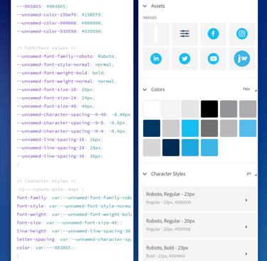
↑ Sampling of handoff files for developers including css, image assets, character style specs. and color specs.
Deploy
Rolling out the platform in phases allowed us to gather feedback and make improvements based on user responses. High adoption rates for the beta versions and post-launch feedback confirmed the success of the platform in fulfilling a genuine need within the enterprise. Metrics such as the adoption rate and reduction in one-off requests for materials highlighted the platform's impact.
Launch
Rolled out the new platform in phases for select users to gather initial feedback. Beta 1 was released to stakeholders and leadership. Beta 2 was released to marketing and sales. Official launch opened the platform up enterprise-wide.
Improvements
Based on post-launch feedback, made additional updates such as refining the filter options, the addition of a quick-start guide, and further enhancing the asset management features for content owners/producers.
Post Launch Analysis
Monitored user feedback and performance metrics. Key metrics included:
Adoption Rate for Beta 1 = 91%
Adoption Rate for Beta 2 = 70%
Enterprise-wide Launch Adoption Rate = 83%
Summing Up ...
The successful design and deployment of the centralized enterprise content management platform for Jabil showcased the importance of user-centric design and collaboration between design and development teams. The project's impact on employee productivity and efficiency underscored the value of investing in user-friendly platforms. By addressing challenges and incorporating feedback, the Content Center platform has become an essential tool for streamlining content management and enhancing user experience at Jabil. This case study serves as a testament to the power of thoughtful design and collaboration in creating impactful solutions for complex business needs.
High adoption rates and positive reviews revealed the fulfillment of a genuine need for the enterprise and the design of a user-friendly platform. Stakeholders reported a significant drop in one-off requests for enterprise materials. Developed a ROI formula to show leadership the business value of the platform.
With plans for future enhancements, such as a personalized asset history, asset list view and additional filter list layout options, Jabil is poised to further improve the platform and continue providing a valuable resource for employees.
Project Impact
Future Steps
