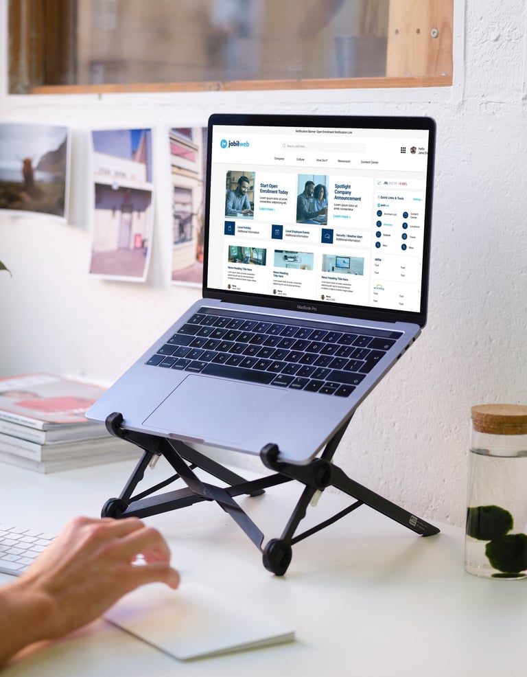
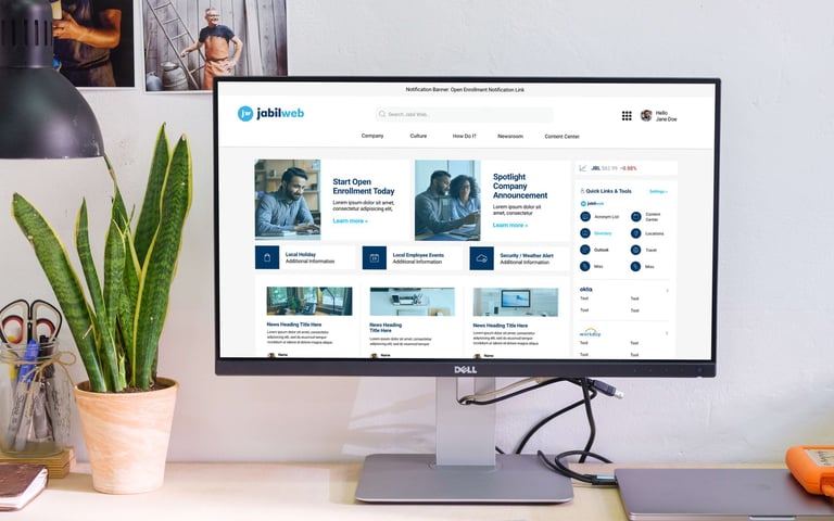
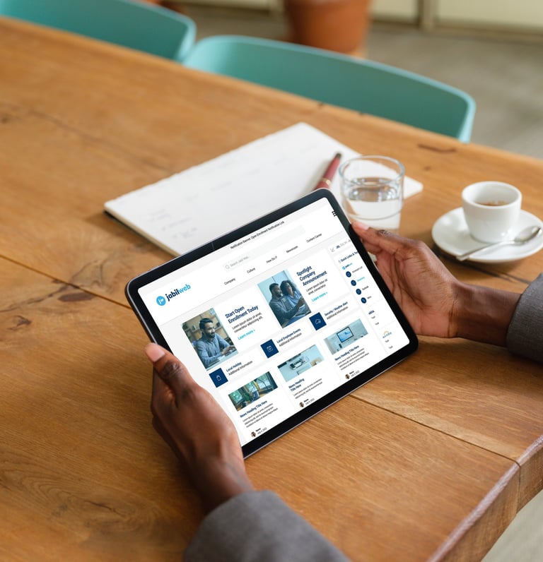
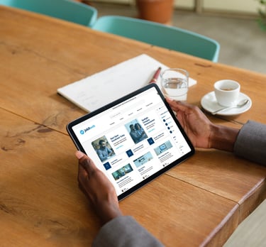
Jabil needed to modernize their corporate intranet to support strategic growth while addressing navigation confusion, poor search functionality, and limited personalization.
Challenge
My Role
Lead Product Designer and Project Lead directing UX research, information architecture redesign, and headless CMS migration.
80% user satisfaction rating (4-5 out of 5), 43% of users rated it "Critical to my Work," and streamlined navigation that reduced decision fatigue across 50,000+ employees.
Outcome
My Design Process: The 5 Ds of Iterative UX/Product Design
The 5 Ds stand as the cornerstone of effective UX design and product development, guiding teams through the iterative process. These key stages are crucial in crafting a user-centric product and serve as my go-to framework when spearheading UX design projects.
Discover: Research and uncover the needs of users and stakeholders.
Define: Clearly state the needs and problems identified in the research phase.
Design: Challenge assumptions, generate ideas, and create innovative solutions.
Develop: Bring ideas to life through building and testing solutions, iterating as needed.
Deploy: Launch solutions, measure performance, and analyze results for further improvement.
As will be demonstrated in this case study, by adhering to the 5 Ds framework, we effectively designed, developed, and launched Jabil's revamped intranet in a systematic and efficient manner.
Discover
Through stakeholder interviews, user surveys, and usability audits, we uncovered key insights that shaped the redesign process. Users expressed challenges with navigation, search functionality, and finding relevant information. The research led to the creation of new features such as a "How Do I...?" guide, personalized content areas, and a streamlined navigation structure to enhance user experience.
Research Objectives
Understand user behaviors, pain points, and needs when using the current intranet.
Research Methods
Held stakeholder and user interview workshops, distributed stakeholder surveys via email, conducted online user pulse surveys, analyzed interaction heat maps, and assessed the usability of the existing intranet. Key stakeholders comprised top decision makers from 13 corporate functions at Jabil, while users represented corporate employees across the company's four main regions: Asia Pacific, Europe, Latin America, and North America.
Key Findings
The current focus of the Intranet is more business-oriented rather than employee-oriented. To address this imbalance, it is important to make key tools and company culture content more visible on the homepage and navigation. A new feature could include a calendar function that highlights both local and global holidays, making it easier for users to access company culture information and stay informed about potential site closings.
Users have expressed frustration with the overwhelming number of navigational choices, leading to decision fatigue and confusion when trying to find important content. To improve the user experience, it is recommended to guide users through content using a drill-down approach to the mega menu, landing pages, and sub-navigations.
Additionally, there are too many navigation links that are duplicated across several drop-down menus. To streamline and reduce overlap, these duplicated links should be organized under a main "Company" heading.
Many employees, especially new hires, struggle to find information and resources. To address this issue, a new "How To..." feature should be created with related content that guides users to important tools, content, and processes.
The search function is currently bloated and does not always provide users with the information they are looking for. Despite this, search remains a prominent way for users to find content. To improve search functionality, it should be scoped to pull results only from the intranet system and the Content Center platform, excluding results from other enterprise SharePoint sites.
Lastly, users desire more personalization options that allow them to see and customize the content that is important to them. Providing flexible content areas where users can highlight their frequently used tools and desired content will help enhance the user experience and make the Intranet more user-friendly.
Define
In order to guide the redesign process, we created meticulously crafted user personas, site maps, and journey maps. By condensing user profiles into personas based on their purposes and needs, we were able to craft an intuitive information architecture and site map that closely reflected input from stakeholders and users. Our goal was to develop a versatile IA structure that could easily adjust to Jabil's changing company structure.
User Personas
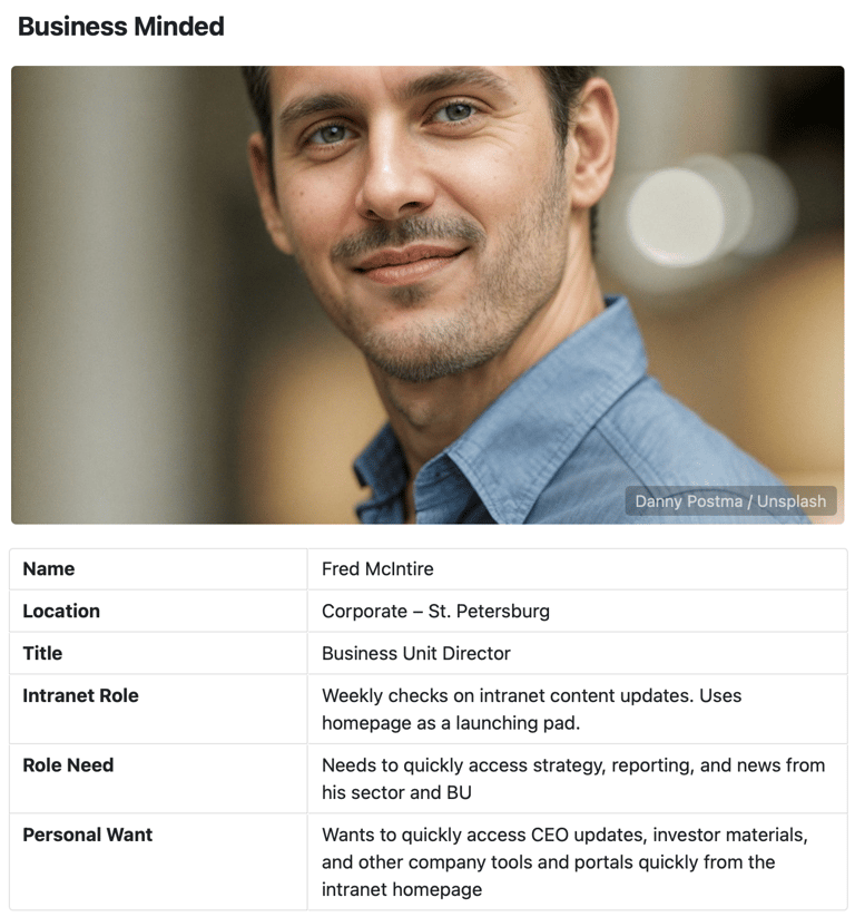
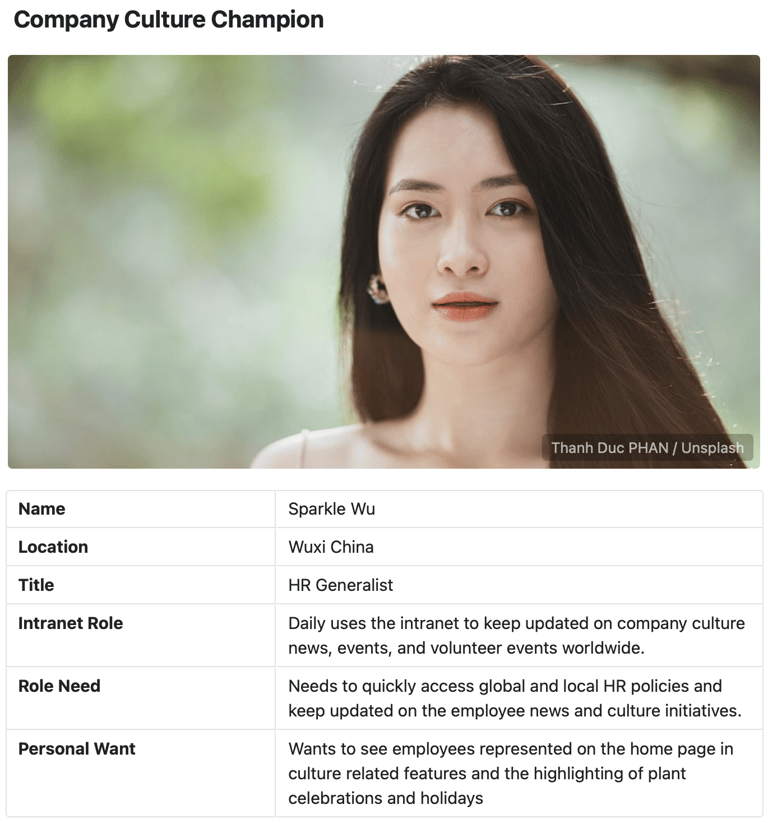
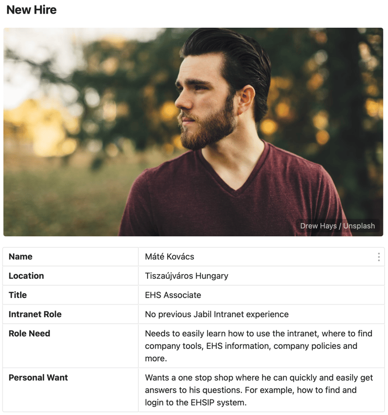
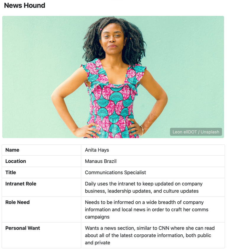
Developed comprehensive personas that accurately depict the primary target users of the intranet. Instead of utilizing complex business unit or company function oriented user profiles (as previously used), the focus has shifted towards creating clear, simplified personas based on specific user needs.
Business Minded
Company Culture Champion
New Hire
News Hound
New Information Architecture, Journey Maps and Site Map
Developed the new site information architecture, journey maps, and site map after gathering feedback from stakeholders and users. Given Jabil's ever-changing company structure, previous IA issues needed to be addressed. As such, the goal was to create a flexible system IA that could easily adapt to future structural changes, ensuring simplicity in matching evolving structures with the front-end IA.

Information Architecture Improvements in Detail
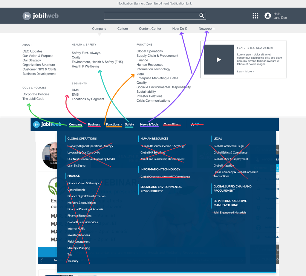
During the Discover phase, users expressed frustration with the site's information architecture (IA) and main navigation, citing the overwhelming number of choices, duplicate items, and confusing top-level headings. This led to decision fatigue and confusion when trying to navigate the intranet and find important content. To address these issues, we made the following changes:
We decided to streamline the IA by removing third-level links from all mega-menu drop downs. Instead, we implemented a guided navigational approach using sectional landing pages with a topical sub-navigation menu. This allows users to move from general to detailed content seamlessly, eliminating the confusion caused by cramming the main navigation with numerous choices.
To simplify the navigation further, we consolidated the Company, Business, Functions, and Safety menus into one main Company menu. This eliminates the need for users to sift through multiple menus to find company-related content.
Based on user feedback from the Discover phase, we created a separate menu for company culture-related content. This addresses the specific needs of users who expressed interest in this type of information.
Furthermore, we introduced a dedicated menu item for the Jabil "Newsroom" content section to provide users with direct access to company and culture news. Previously, users had difficulty finding this content, so this change improves accessibility.
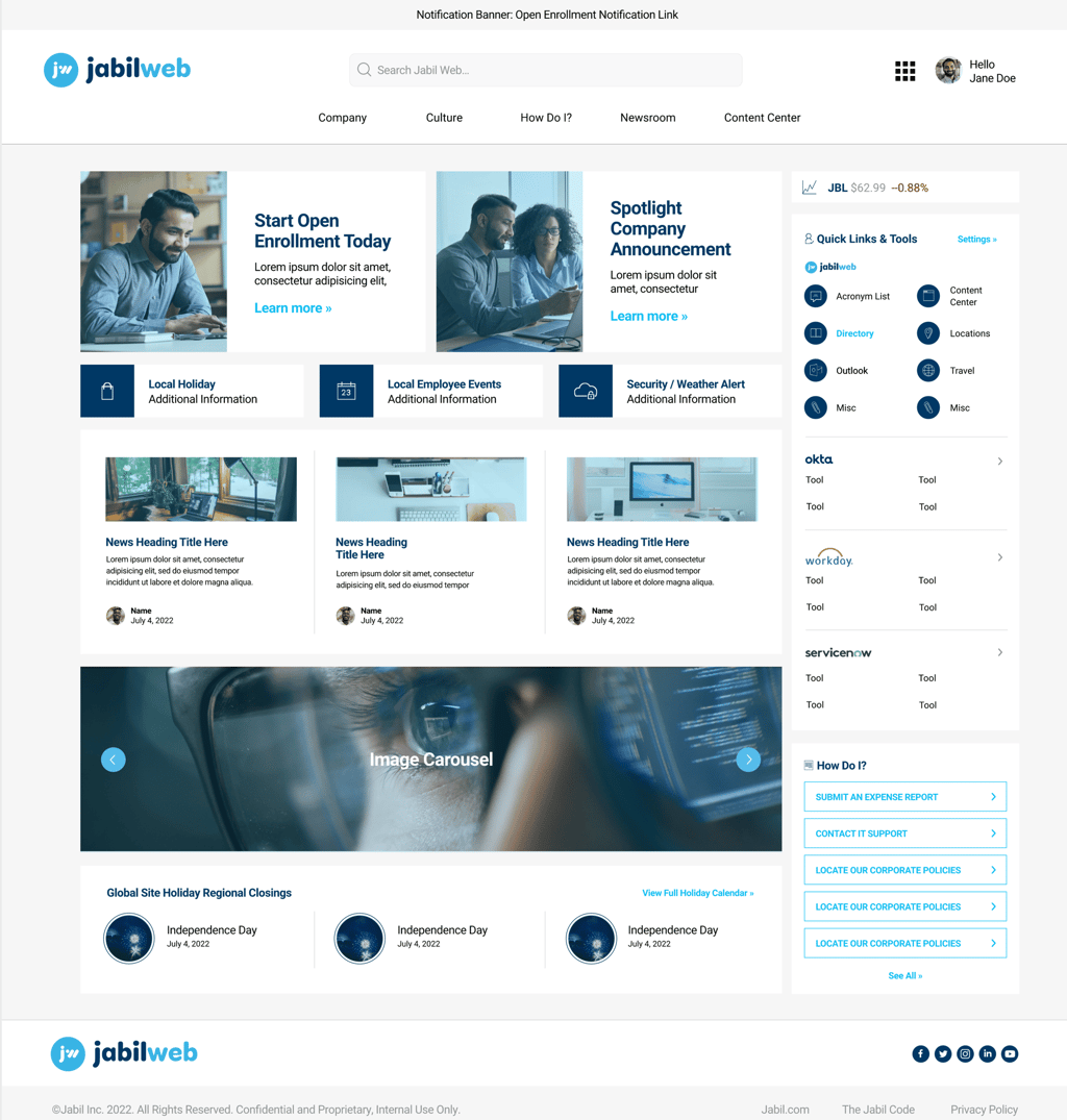
To optimize the main IA, we removed links to enterprise tools and relocated them to the user customizable "Quick Links" feature. This freed up space in the main navigation for a new "How Do I?" section, which aims to provide guidance to users.
We also removed menu items with poor usage statistics and added a link to the newly developed Content Center portal for increased visibility and user engagement. This integration enhances the connectivity between the two platforms and encourages users to explore content more effectively.
↑ Information Architecture (IA) Updates Visual
Design
Through ideation workshops and design sprints, we were able to develop both low-fidelity wireframes and high-fidelity prototypes for the new intranet. These prototypes effectively showcased the design, functionalities, and layouts of the system. User testing played a crucial role in refining the design, with users commending the clean, modern design and intuitive navigation structure. We continuously iterated on the design, taking into account feedback and technical limitations to ensure a seamless user experience.
Ideation
We facilitated a discovery workshop, conducted brainstorming sessions, and engaged in design sprints to collaboratively generate innovative ideas for the new intranet's design, functionalities, layouts, and components.
Wireframes
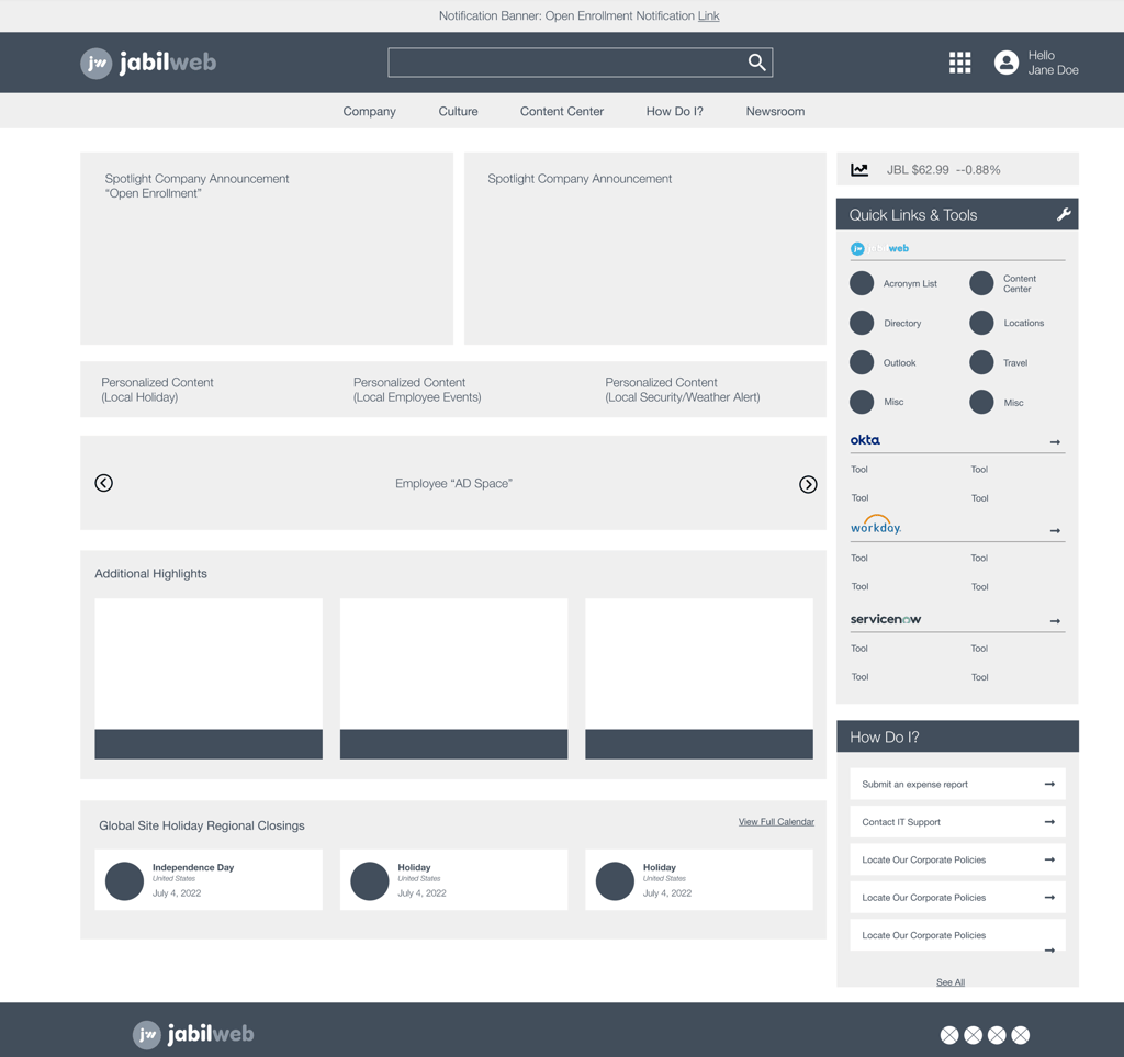
Wireframes were created at a low-fidelity level to establish the main layouts, determine essential interface elements, and solidify the placement of features.
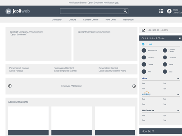
Note on Mobile: Because Jabil's mobile device engagement was typically < 4% of users on enterprise tools, we focused on desktop devices. However mobile wireframes were included to show developers how layouts should collapse/modify for mobile.
User Testing
Conducted two rounds of usability tests, both remotely and in-person, with stakeholders and users via the prototype to gather feedback and refine the designs. Key insights included:
Users liked the clean/modern design
Users found the new IA/Navigation structure more intuitive and easy to follow
Users were excited about the new "How Do I?" functionality and expanded quick links/tools on the right hand side of the home screen
Some users still expressed deep concerns over search results on the new platform. Decided to build a working HTML/CSS/JS prototype with home screen, search results screen, and 10 content screens to show how the search will function and how the new platform will clean up the search results screen
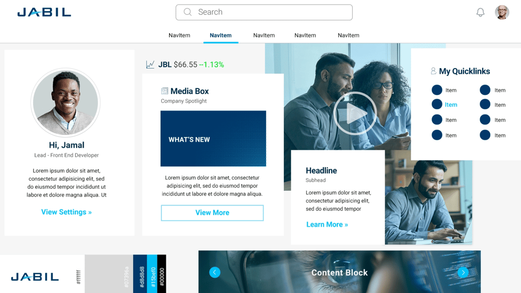
Leadership wanted to introduce a little more vibrancy into the color palette via the introduction of a third, accent color.
Prototype & Component Exemplars
Developed a polished, high-fidelity prototype that showcases all visual design choices and important interface feature interactions. Produced a detailed exemplar sheet highlighting the visual design and user interface elements of each component. Constructed an interactive HTML/CSS/JS prototype of the home screen and other critical layouts for rigorous design and user testing.
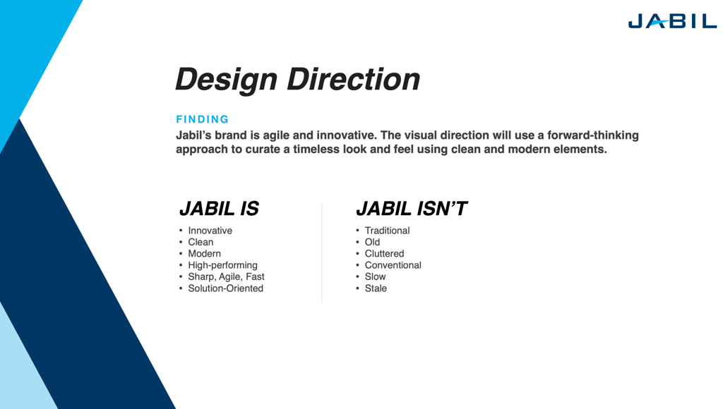
↑ Discovery Workshop Output – Design Direction based on what we want to imply through design about what Jabil is / is not.
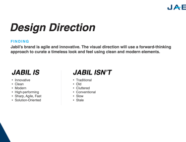
↑ Final Design Direction – Result of first 2 design sprints.
↑ Final Homepage Wireframe
↑ Final Homepage Prototype
Develop
Collaborating closely with developers, we delivered detailed hand-off files and assets to guarantee the precise execution of our designs. Striking a balance between consistency and flexibility, we created components that empowered content owners to showcase materials in distinctive ways while upholding a smooth user experience. Despite challenges in maintaining design integrity while accommodating content owners' needs for flexibility, we overcame them through teamwork and continuous refinement.
Collaboration with Developers
Worked closely with the development team to ensure the designs were implemented accurately and efficiently. Project update calls were held with developers weekly to review progress, answer questions, and discuss challenges.
Challenges
It was a challenge to strike a balance between maintaining a polished, user-friendly design and allowing flexibility for content creators to showcase materials in a creative, non-traditional manner. To address this, we created multiple versions of each component and collaborated closely with developers to eliminate rigid, pre-set elements from the CMS. This enabled content creators to have the freedom they desired, without compromising the overall user experience.
After receiving feedback from users and considering technical constraints, multiple iterations were completed. One key change was adjusting the functionality of the "Workday" and "Okta" tool sections to align with current development restrictions. Originally, the plan was to have these sections dynamically pull the users' favorite links from these tools for display on the intranet homepage. However, due to security and time limitations, we opted for hard-coded, most-used links initially, with plans to implement the dynamic feature in a future iteration post-launch.
During the content development phase, it became apparent that many content creators were using components in unexpected ways and locations. This led to extensive revisions to ensure the components were highly adaptable, both in terms of design and development. This involved a significant amount of back-and-forth work to meet the evolving needs of the project.
Design Iterations
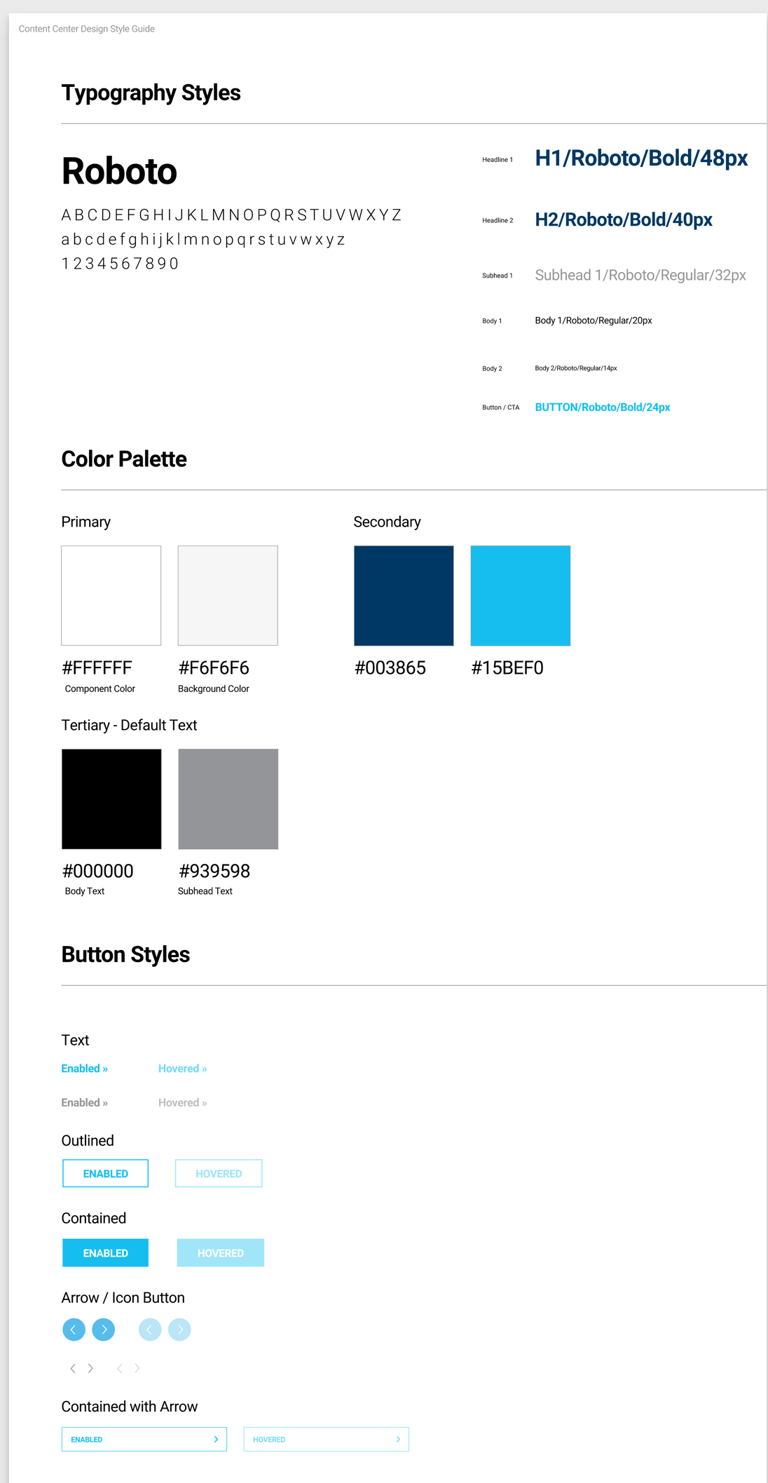

↑ Design System
Deploy
The new platform underwent several private Beta phases to gather feedback and address bugs prior to the official enterprise-wide launch. Following the launch, an analysis showed that users were highly satisfied and engaged, with key metrics indicating that the intranet played a critical role in enhancing employees' job performance. Further improvements were implemented based on feedback to continuously enhance the user experience.
Launch
Rolled out the new platform in private Beta phases for select users to gather initial feedback and catch last-minute bugs. Design, development, and content clean-up steps were taken after each private Beta phase.
Private Beta 1 launched to Marketing/Sales/Communications leadership and Jabil's C-Suite
Private Beta 2 launched to the project stakeholders from all corporate functions and business units
Private Beta 3 launched to the Marketing/Sales/Communications department
Private Beta 4 launched to high profile users in Jabil's 4 main regions: Asia-Pacific, Europe, Latin America, North America
Official launch opened the intranet enterprise-wide.
Improvements
Based on post-launch feedback, made additional updates such as refining search filter options, the addition of a intranet quick-start guide, and further enhancing the personalized content options for users.
Post Launch Analysis
Overall satisfaction ratings were high, with 80% of users giving a rating of 4-5 out of 5. Additionally, the majority of users, at 76%, rated the user experience as 4-5 out of 5. Furthermore, a significant 43% of users deemed the product to be "Critical to my Work" in terms of usefulness for job performance.
Summing Up ...
The project exceeded expectations by effectively addressing the enterprise's needs, leading to widespread adoption and positive feedback for its user-friendly intranet design. Stakeholders experienced heightened engagement and a deeper understanding of the company's operations, while leadership noted enhanced communication reach and effectiveness. Key performance indicators were implemented to monitor ongoing engagement and return on investment. Valuable insights highlighted the significance of flexibility in design and development, paving the way for enhanced personalization and localization in future iterations.
The high satisfaction rates and positive reviews demonstrated the successful fulfillment of a genuine need within the enterprise, as well as the creation of a user-friendly intranet platform. Stakeholders in communications noted heightened engagement with their campaigns, a deeper understanding of Jabil's intricate business operations, and company leadership acknowledged an expanded reach and improved comprehension of core messaging. Key Performance Indicators (KPIs) were established to monitor continued engagement and showcase the return on investment of the intranet project.
The aim is to further enhance the intranet by incorporating more personalization and localization features. This includes utilizing personal preferences and data from various company platforms to tailor content, as well as offering featured or targeted information based on the user's location and/or role within the organization.
Project Impact
Future Steps
