Five Ds of iterative UX — applied
My 5 Ds of Iterative UX Design
I led this project through a structured five-phase methodology: Discover, Define, Design, Develop, Deploy. Each phase builds on validated learning from the previous — ensuring we didn't just create another platform employees would ignore.
Starting with users, not assumptions
I interviewed employees and stakeholders across HR, Legal, IT, Operations, and Sales. I analyzed 12 months of usage data and support tickets, audited all existing platforms for content overlap, and mapped real user workflows — how people actually tried to find a policy, retrieve a template, or access a brand asset.
I also conducted a competitive analysis of enterprise content systems to understand what best-in-class looked like. None of this was about building a feature list. It was about understanding the root cause of the problem.
- 80% of content was rarely or never accessed — the 20% that mattered was buried
- Users wanted search-first navigation, not folder-drilling
- Visual asset preview was essential — employees couldn't identify files without opening them
- Mobile access was critical for field and on-the-go employees
- Version confusion was eroding trust in all platforms equally
One north star, clearly articulated
I created a unified information architecture that consolidated the disparate taxonomies of six platforms into a single coherent structure. I defined a content governance model covering who creates, approves, and archives content — because the best-designed platform fails if content goes stale within six months.
- "Single source of truth" established as the non-negotiable north star
- Success defined as: find any resource in under 3 clicks
- Search-first UX with smart filters — not folder navigation
- Phased rollout: pilot group → department → global
- Selective content migration — not everything earned a place in the new system
Tested with real users before a line of code was written
Low-fidelity wireframes were tested with employees from different departments and roles before I moved to high-fidelity. This was deliberate — catching navigation issues, terminology problems, and usability gaps when they were cheap to fix, not after development had locked them in.
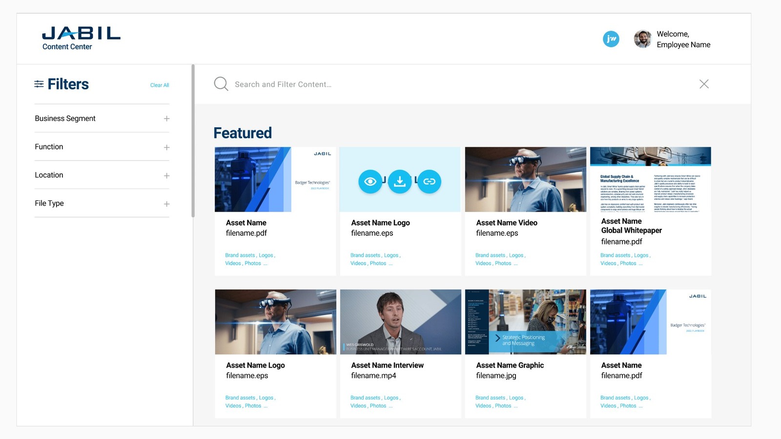
Design principles drove every decision: search-first with smart autocomplete, card-based scannable layouts, contextual personalization by role and location, mobile-ready touch-optimized interfaces, and performance-optimized for global access across varying bandwidth conditions.
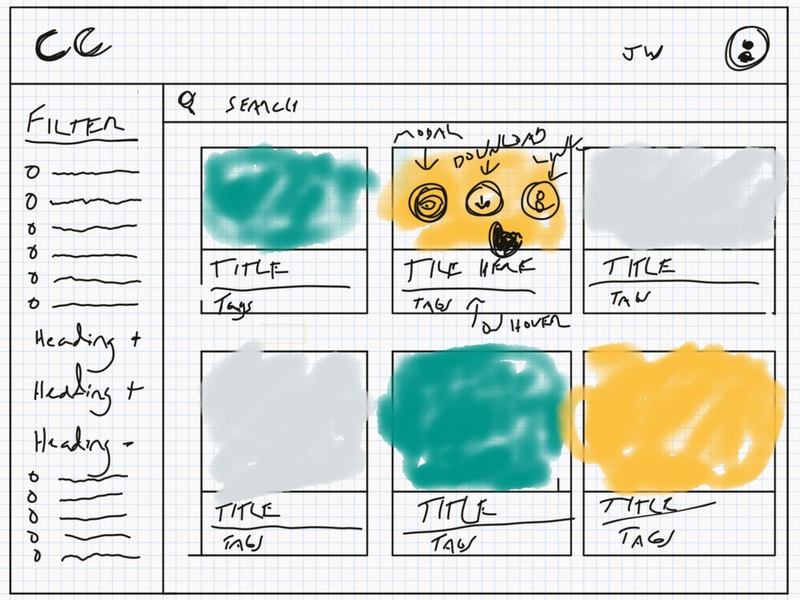
Lo-fi sketch
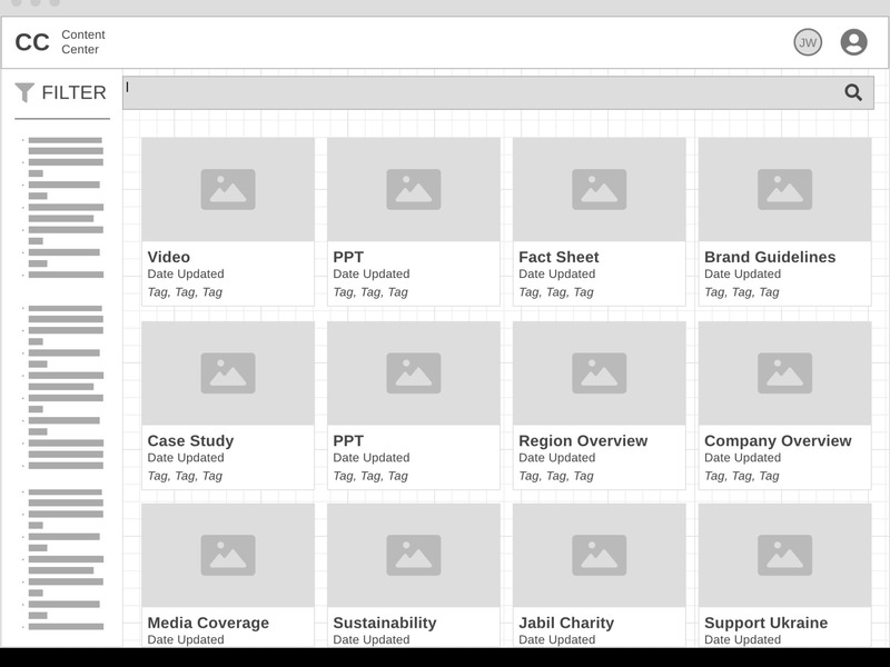
Mid-fi wireframe
Staying close to the build — not just handing off
I partnered with an external development vendor throughout the build, running weekly design reviews during sprint cycles and making real-time adjustments as technical constraints emerged. The goal was always to preserve the user experience intent — not sacrifice it for engineering convenience.
- Simplified filtering UI based on performance testing results
- Added "Recently Viewed" and "Frequently Accessed" sections based on pilot feedback
- Built admin dashboard for the content governance team
- Integrated with existing SSO and permissions infrastructure
83% adoption didn't happen by accident
I launched to a pilot group first, gathered structured feedback, refined the experience, then rolled out phased to 50,000 employees globally. I invested in change management from day one — training materials, communications campaigns, and early-adopter feedback loops — because adoption requires deliberate effort, not just a good product.
- Enhanced search algorithm based on real query patterns from launch data
- Added "Favorite" and "Share" features by popular employee request
- Implemented content health metrics for the governance team
- Continuous improvement process established for ongoing iteration